Hello, I’m Konrad Sieńkowski and I am a front-end developer & UI designer here at Bytewax. I want to share with you something that I worked on recently. In this article, I'll walk through the steps to set up a new Vue application, configure the router for nested routes, create the AppTabs.vue component, and customize your tabs using route meta fields for labels and icons. By the end, you'll know how to make an easy yet flexible solution for displaying child routes in tabs. So, let's dive in!
For those eager to dive in, check out the project repository on Github.
Prerequisites
First of all, we're going to create a fresh, new application using > npm init vue@latest. The vue-create tool is going to ask you about including optional features in the project. The only one required for that tutorial is Vue Router. I chose Typescript & Prettier as well, but it's up to your personal preferences.
Preparing routes & structure
Once you follow the instructions on installing dependencies and running the app, you can start customizing the application. My first step was to simplify app.vue a bit:
<template>
  <nav>
    <RouterLink to="/">Home</RouterLink>
    <RouterLink to="/tabs">Tabs demo</RouterLink>
  </nav>

  <RouterView />
</template>

<script setup lang="ts">
import { RouterLink, RouterView } from "vue-router";
</script>
Since we're focusing on nested/child routes in this article, there's no need to spend much time on the homepage. I've also renamed default AboutView.vue to TabsView.vue and created bunch of example views in views/tabs, called TabsAbout.vue, TabsBlog.vue, TabsContact.vue, TabsRelated.vue. We're going to include them in our routes structure in the next step.
- views
-- tabs
--- TabsAbout.vue
--- TabsBlog.vue
--- TabsContact.vue
--- TabsRelated.vue
-- HomeView.vue
-- TabsView.vue
As we have a simple structure for our views/pages, now it's time to include them in router configuration. Let's open router/index.ts now and adjust it to our needs:
import { createRouter, createWebHistory } from "vue-router";
import HomeView from "../views/HomeView.vue";

const router = createRouter({
  history: createWebHistory(import.meta.env.BASE_URL),
  routes: [
    {
      path: "/",
      name: "home",
      component: HomeView,
    },
    {
      path: "/tabs",
      name: "tabs",
      component: () => import("../views/TabsView.vue"),
      children: [
        {
          name: "about",
          path: "",
          component: () => import("../views/tabs/TabsAbout.vue"),
        },
        {
          name: "blog",
          path: "blog",
          component: () => import("../views/tabs/TabsBlog.vue"),
        },
        {
          name: "contact",
          path: "contact",
          component: () => import("../views/tabs/TabsContact.vue"),
        },
        {
          name: "related",
          path: "related",
          component: () => import("../views/tabs/TabsRelated.vue"),
        },
      ],
    },
  ],
});

export default router;
Now, our application has nested/children routes which we can use to display tabs in the component.
Tabs component
In this step, we're going to create our tab component, include it in the first-level route view and then extend it with additional features. First of all, we're going to create file called AppTabs.vue in components directory. Since our component is going to be flexible and might be used in different routes, we're following Vue naming convention for base components.
Let's start from the <script setup> section. We're using useRouter() composable there to access the router instance. Then, we're using it to define tabs computed property.
<script setup lang="ts">
import { computed, type ComputedRef } from "vue";
import { useRouter, RouterView, type RouteRecordRaw } from "vue-router";

// Use children routes for the tabs
const router = useRouter();
const tabs: ComputedRef<RouteRecordRaw[] | undefined> = computed(() => {
  const currentRoute = router.currentRoute.value.name;
  return router.options.routes?.find(
    (route) =>
      route.name === currentRoute ||
      route.children?.find((child) => child.name === currentRoute),
  )?.children;
});
</script>
After getting the current route name using router.currentRoute property, we're using it to find it within the routes array (either within top-level routes and their children) and return its children routes. Now it's time to include it in the component template:
<template>
  <div class="tabs" v-if="tabs">
    <nav class="tabs__nav">
      <RouterLink
        v-for="tab in tabs"
        :key="tab.name"
        class="tabs__nav-item"
        :to="{ name: tab.name }"
      >
        {{ tab.name }}
      </RouterLink>
    </nav>
    <div class="tabs__wrapper">
      <RouterView v-slot="{ Component }">
        <Transition name="fade" mode="out-in">
          <component :is="Component"></component>
        </Transition>
      </RouterView>
    </div>
  </div>
</template>
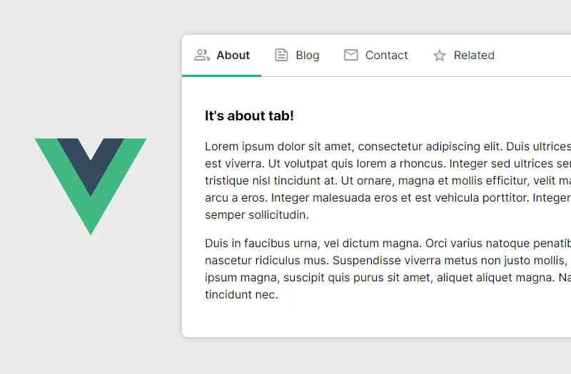
Inside the <div> wrapper, we have two parts of our component:
- navigation / tabs, where we iterate over output of
tabscomputed getter and display links of children routes, - tabs wrapper, where we're using native
<RouterView>and its v-slot api to wrap nested route's content in<Transition>component.
Now we can include our component in the TabsView.vue code:
<template>
  <div class="view">
    <AppTabs />
  </div>
</template>

<script setup lang="ts">
import AppTabs from "@/components/AppTabs.vue";
</script>
And take a look at the result:

Extending & styling up the tabs
Our tabs work nice, and we can easily include them in any view that has child routes. However, the tabs navigation uses route.name as a link label, and route names should rather remain simple and easy to use. We can extend our solution with route props to include custom tab label & icon for each child route.
Use custom route props
Before extending our component's code, let's add meta field to each nested route in router/index.ts:
children: [
  {
    name: "about",
    path: "",
    component: () => import("../views/tabs/TabsAbout.vue"),
    meta: { tabLabel: "About" },
  },
  {
    name: "blog",
    path: "blog",
    component: () => import("../views/tabs/TabsBlog.vue"),
    meta: { tabLabel: "Blog" },
  },
  {
    name: "contact",
    path: "contact",
    component: () => import("../views/tabs/TabsContact.vue"),
    meta: { tabLabel: "Contact" },
  },
  {
    name: "related",
    path: "related",
    component: () => import("../views/tabs/TabsRelated.vue"),
    meta: { tabLabel: "Related" },
  },
];
Now, we can use tabLabel value in our AppTabs.vue component:
<RouterLink
  v-for="tab in tabs"
  :key="tab.name"
  class="tabs__nav-item"
  :to="{ name: tab.name }"
>
  <span class="tabs__nav-label" v-if="tab.meta?.tabLabel">{{ tab.meta.tabLabel }}</span>
</RouterLink>
Add material icons to tabs navigation
Our tabs navigation is going to look better with icons. Let's install Google's Material Symbols library using npm package: npm install material-symbols@latest and include it in main.ts (main.js if you're not using typescript):
import { createApp } from "vue";
import App from "./App.vue";
import router from "./router";

import "material-symbols/outlined.css";
import "./assets/main.css";

const app = createApp(App);

app.use(router);

app.mount("#app");
Then, we can add tabIcon properties to route meta fields, filling it with the icon codes:
children: [
  {
    name: "about",
    path: "",
    component: () => import("../views/tabs/TabsAbout.vue"),
    meta: { tabLabel: "About", tabIcon: "group" },
  },
  {
    name: "blog",
    path: "blog",
    component: () => import("../views/tabs/TabsBlog.vue"),
    meta: { tabLabel: "Blog", tabIcon: "feed" },
  },
  {
    name: "contact",
    path: "contact",
    component: () => import("../views/tabs/TabsContact.vue"),
    meta: { tabLabel: "Contact", tabIcon: "email" },
  },
  {
    name: "related",
    path: "related",
    component: () => import("../views/tabs/TabsRelated.vue"),
    meta: { tabLabel: "Related", tabIcon: "star" },
  },
];
After that, we're ready to include them in the component:
<RouterLink
  v-for="tab in tabs"
  :key="tab.name"
  class="tabs__nav-item"
  :to="{ name: tab.name }"
>
  <span class="tabs__nav-icon material-symbols-outlined" v-if="tab.meta?.tabIcon">{{
    tab.meta.tabIcon
  }}</span>
  <span class="tabs__nav-label" v-if="tab.meta?.tabLabel">{{ tab.meta.tabLabel }}</span>
</RouterLink>
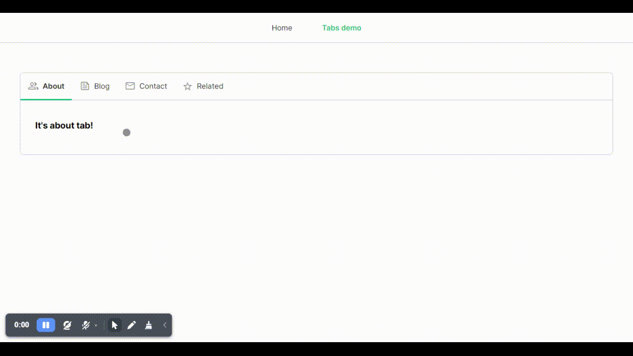
Done! We have custom icons & labels based on route meta fields displayed in our Tabs component. Now it's time to add final styling touch with CSS.
Styling up the component
You can style up the component on your own, customizing it fully to your needs or use code below including it in AppTabs.vue below:
<style>
.tabs {
  border: 1px solid rgba(0, 0, 0, 0.2);
  border-radius: 0.5rem;
}
.tabs__wrapper {
  padding: 1.5rem 2rem 2rem 2rem;
}
.tabs__nav {
  display: flex;
  flex-direction: row;
  border-bottom: 1px solid rgba(0, 0, 0, 0.2);
}
.tabs__nav-item {
  display: flex;
  flex-direction: row;
  align-items: center;
  flex-wrap: nowrap;
  text-decoration: none;
  padding: 1rem;
  border-bottom: 3px solid transparent;
  margin-bottom: -1px;
  color: rgba(0, 0, 0, 0.87);
  transition: border-color 0.25s ease-in-out;
}
.tabs__nav-icon {
  margin-right: 0.5rem;
  color: rgba(0, 0, 0, 0.38);
}
.tabs__nav-item:hover {
  border-color: #ccc;
}
.tabs__nav-item.router-link-exact-active {
  border-color: var(--green);
  font-weight: 600;
}
</style>
Note: Following BEM naming convention is easier using SCSS but I didn't want to fill the example with extra dependencies.
Our tab component looks pretty slick now:
Instead of conclusion
Now, I encourage you to give it a try, explore further customizations, and share your experiences and improvements with our community. Let's continue building more efficient and elegant applications together!
Scaling One Developer - Building a Python Stream Processor

Konrad Sienkowski
Front-end DeveloperKonrad is a front-end developer & UI designer with 8 years of experience in developing websites & applications. His design background - graphic design & communication design faculties at university, combined with practice - makes him focus on user experience and details.